Creating responsive PowerApps is essential for ensuring that your applications work smoothly across a variety of devices, from desktops to tablets to smartphones. This not only improves the user experience but also maximizes the reach and effectiveness of your app. Here’s a comprehensive guide to help you build responsive PowerApps.
Understanding the Basics of Responsiveness
Responsiveness in PowerApps means the app can adapt its layout and components dynamically based on the size and orientation of the screen. A responsive app should look good and be functional whether viewed on a large desktop monitor or a small mobile device.
Start with a Mobile-First Design
Designing with a mobile-first approach ensures that your app is optimized for smaller screens from the start. This approach makes it easier to scale up for larger screens rather than trying to condense a desktop-oriented design for mobile use.
Steps for Mobile-First Design:
- Set the Default Screen Size:When creating a new app, start by setting the default screen size to a mobile resolution.
- Use Smaller Components:Design UI elements to fit within a mobile screen first.
- Test on Mobile Devices: Regularly test your app on actual mobile devices to ensure usability.
Utilize Containers and Layouts
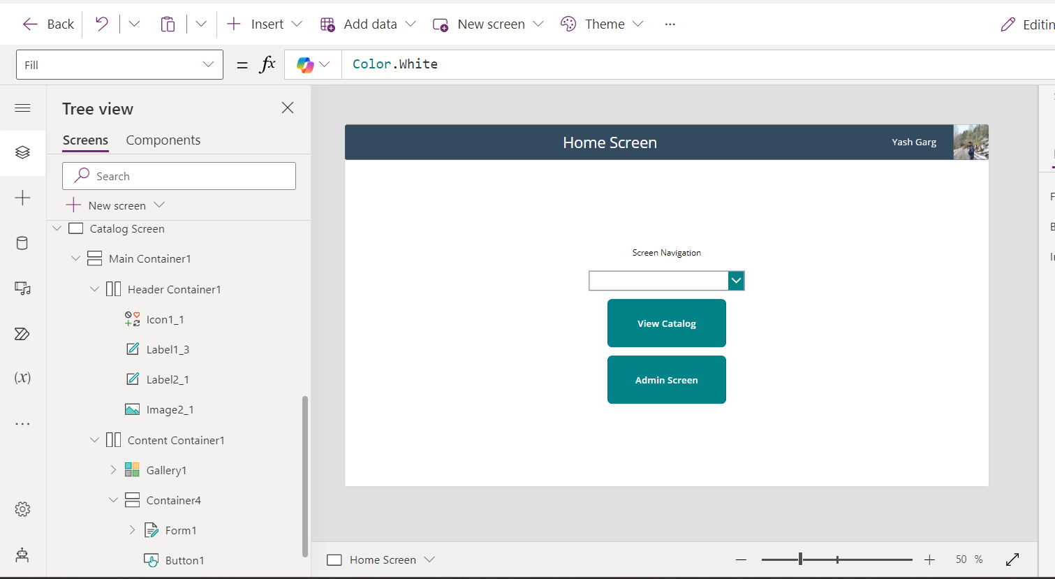
PowerApps provides several layout controls that help create responsive designs, including the Vertical, Horizontal, and Flexible Height/Width containers.
Using Containers:
- Vertical Container:Use this for stacking elements vertically. It adjusts to the height of its children, making it useful for mobile views.
- Horizontal Container:Use this for arranging elements side by side. It adjusts to the width of its children.
- Flexible Height/Width: These containers adjust their dimensions based on the content and screen size, allowing for fluid designs.
Use Relative Sizing and Positioning
Avoid fixed sizes and absolute positioning. Instead, use relative measurements and dynamic properties to ensure components adjust according to the screen size.
Tips for Relative Sizing:
- Width and Height:Set these properties using percentages relative to App.Width and App.Height.
- Padding and Margins:Use relative values to maintain spacing across different screen sizes.
- Alignments:Use the Align and AlignSelf properties to center or align components within containers.

Implement Breakpoints
Breakpoints allow you to define different styles for different screen sizes. By setting breakpoints, you can tailor the UI to provide an optimal experience on different devices.
How to Implement Breakpoints:
- Define Breakpoints: Set specific screen widths (e.g., 600px, 900px) at which the layout changes.
- Conditional Formatting:Use If statements to change properties based on the screen width. For example, change the number of columns in a gallery from 1 on small screens to 2 or 3 on larger screens.
Leverage the App’s Orientation and Size Properties
PowerApps provides properties like App.Width, App.Height, App.Size, and App.Orientation that you can use to dynamically adjust your app’s layout.
Practical Usage:
- Orientation: Use App.Orientation to switch between portrait and landscape layouts.
- Dynamic Layouts:Adjust the layout based on App.Width and App.Height to accommodate different screen sizes.
Optimize Performance
Responsive apps can sometimes become sluggish if not optimized properly. Here are some tips to ensure your app remains fast and responsive:
- Minimize OnVisible and OnStart Loads: Load only essential data when the app starts and defer other data loads until necessary.
- Use Delegation:Ensure data operations are delegated to the server to handle large datasets efficiently.
- Optimize Images and Media:Compress images and use media formats optimized for web delivery.
Test Across Multiple Devices
Finally, always test your PowerApps on various devices with different screen sizes and orientations. This real-world testing helps identify issues that might not be apparent in the PowerApps studio.
Testing Checklist:
- Functionality:Ensure all features work as expected on different devices.
- Usability:Check if the app is easy to navigate and use on smaller screens.
- Performance:Monitor load times and responsiveness.
Conclusion
Creating responsive PowerApps requires thoughtful design, use of flexible layouts, and constant testing. By following the steps outlined in this guide, you can develop PowerApps that provide a seamless user experience across all devices. Remember, the key to a successful responsive app is adaptability, ensuring your app looks and works great regardless of where it’s accessed. Happy building!

